Presentation and Visualization Methods
There are several ways to present the large amount of data that is in the underlying databases. Today, many business intelligence software vendors are making it possible for users to access key business metrics, reports and dashboards through a large number of visualization methods that make it easy for executives to analyze the data. In order to demonstrate few presentation and data visualization methods, I would make use of the following three vignettes:
- Electronic Commerce
- Transport
- Healthcare
Electronic Commerce
The online marketing space is in constant shift as new technologies, services, and marketing tactics gain popularity and become the new standard. Online store owners are one of the many different segments affected by these constant evolutions. In order for these business owners to survive and thrive, they need to be able to make better decisions faster. This is where web analytics comes into play.
An important metric that an e-commerce site would want to capture is as follows:
Most productive month in a year based on Gross Sales
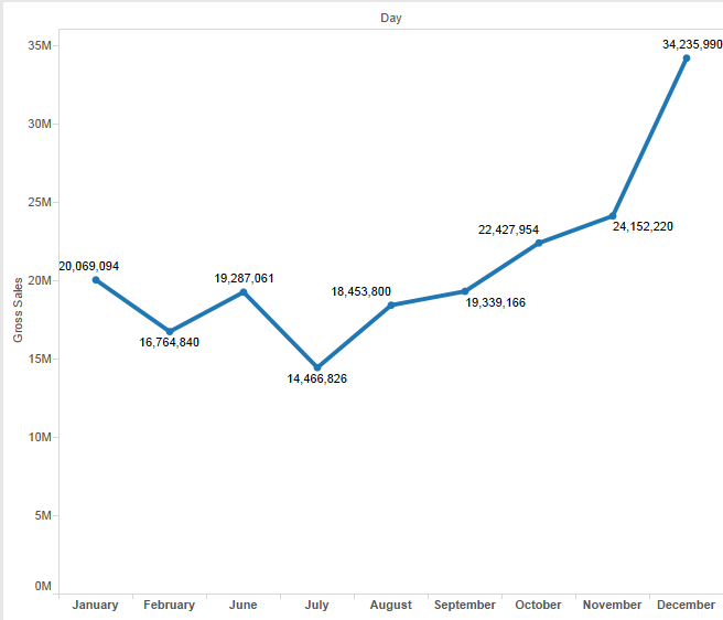
I have made use of a Line Graph to depict the gross sales by month. The graph plots a dot for the gross sales each month and the elevations in the lines effortlessly depict the most and the least productive month. Based on such graphs, it becomes easier for the organizations to uncover findings for strategic analysis. For example, as per the above graph, it may be concluded that November and December happen to be the most productive months for this organization in terms of gross sales. Probably because it’s holiday season causing shopping and promotional sales to start in advance.
Transport
The power of big data tools and web analytics techniques help the transportation industry improve operations, reduce costs and better serve travelers by crafting important depictions from the large volume of data in underlying databases.
The following graph shows the Cost Efficiency of different modes of Transportation.
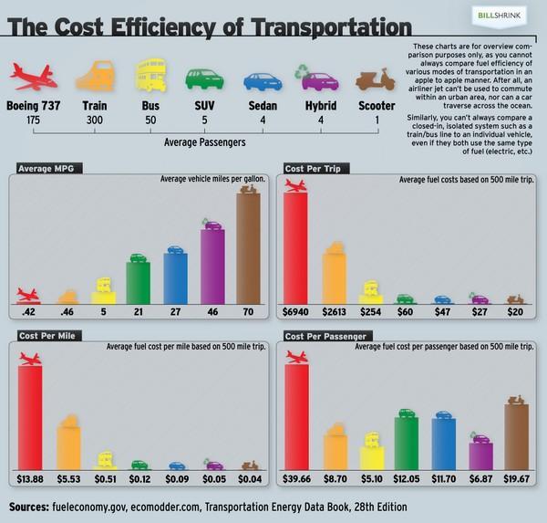
This is a Bar Graph, where each bar depicts a mode of transport and the level of each bar depicts a measure. The graphs show the cost efficiency of various modes of transportations based on different factors. By looking at the graph, we can easily conclude that an airplane is the most expensive mode of transport, and a scooter although has the lowest Cost per Trip, has a high Cost per Passenger. Similar conclusions about other means of transport may be observed.
Healthcare
Driven by industry trends, the analysis of large sets of data, such as medication usage or hospital readmissions, has enabled health care providers and policymakers to make smarter decisions and predict future trends. Electronic medical records and decisions by governments and companies to share data have made for smarter decision-making that can save money and provide better care.
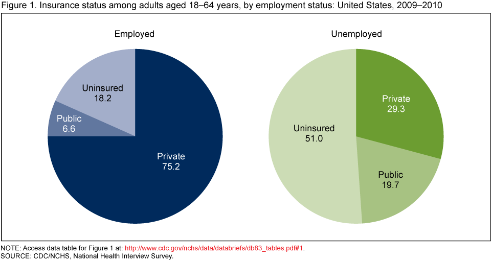
The graph below is a Pie Chart that depicts the Insurance Status of Employed and Unemployed adults aged 18-64 in the United States for the year 2009-2010. Thus we deal with a large number of dimensions, such as people, date, employment and insurance. By looking at the graph, we may easily conclude that among the employed adults, maximum are privately insured whereas among the unemployed adults, maximum are uninsured.
In conclusion, we saw how different types of visualization methods make it so easy for high-level executives to interpret data. In absence of such visualizations, the executives would have to look at large amounts of structured and unstructured data and it would take them several days, months or even years to make sense out of it. Therefore, data visualization tools such as Tableau and Qlikview have become extremely popular these days.
References:
http://www.usatoday.com/story/news/nation/2013/11/24/big-data-health-care/3631211/